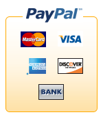
...are the ugliest things I've ever seen. The people PayPal has employed are clearly not graphics artists. And also don't have the web developer in mind.
 About a couple weeks ago every business customer received a "teaser" e-mail from PayPal saying to get ready for new logos and buttons for use on websites. Mentally, I thought, "Sweet! Maybe they won't stink like the current ones." Today, PayPal sent every business customer an e-mail saying the logos and buttons were ready for use on websites and sent us all to their website via a link.
I clicked the link and, lo and behold, awful-looking images stared me in the face that are worse than the old ones (but that isn't saying much). The image above is the worst of the lot, but they are all pretty bad. Let me name off my reasons:
1) Every last image is a GIF image. Which makes the gradient look awful, severely limiting color choice, and offers extremely limited transparency options. PNG - enough said.
2) There is an ugly white border around the entire image. This makes it impossible to put the image on any color without making the ugly border instantly stand out.
3) Placement of the "icons". Oh where do I begin? It looks like a 'V' shape which just makes everything feel awkward. The icon sizing looks like a child did it. At least make them all the same size - bicubic scale them up to the largest length/width in each direction and then scale down. Yes it will make them look funny. But there is this tool called Photoshop that can do magical things like edit the images to extend them. At that size, no one will notice and everything will be pixel-aligned.
4) Speaking of Photoshop. Let us have PSDs of the logos and buttons already. That way WE can decide what the buttons look like and what file format. And, surprise! We don't like your buttons. You stink at graphics arts. Go back to school.
5) What is up with the extra inner space - especially all that space under "Bank"?
6) Putting PayPal above the icon work is just a bad idea. Sure it emphasizes that PayPal is being used, but it is completely unnecessary. All people want to know is "What sort of online payment methods does your business accept". Put PayPal first for all I care in the ordering, but PLEASE do not look ugly while doing it. Either completely encase the PayPal logo in the orange border or put it inside the box and make the border at the top thinner. What you have currently is plain ugly.
7) 3 of 5 of the icons have borders (natural or otherwise). Make them all have borders even if they normally don't. The "Visa" icon, in particular, looks awful against the orange background.
Digg this
Comments
Post a Comment